
I love eavesdropping visually on other people’s creative processes. It’s fascinating to see how creative projects evolve over time.
In today’s note, I thought I’d share the steps from some of my logo design projects so you can do your own visual eavesdropping.
Logos offer a great combination of free-form creativity with the restrictions of client needs, preferences and reviews. The following captures a glimpse at the balance between creativity and feedback– a process that, while it may not always be simple and straightforward, helps lead to good design and products clients will love.
I hope you enjoy!
We Speak Franchise
This project began with the fairly open direction of a clean, simple and bright logo for a new public speaking and events management company that focuses on the needs of the franchise industry.
Round 1. We started with a round of broad sketches to explore various color palettes, fonts and icons. The goal of this round was to gather client preferences and focus in on a possible design direction.
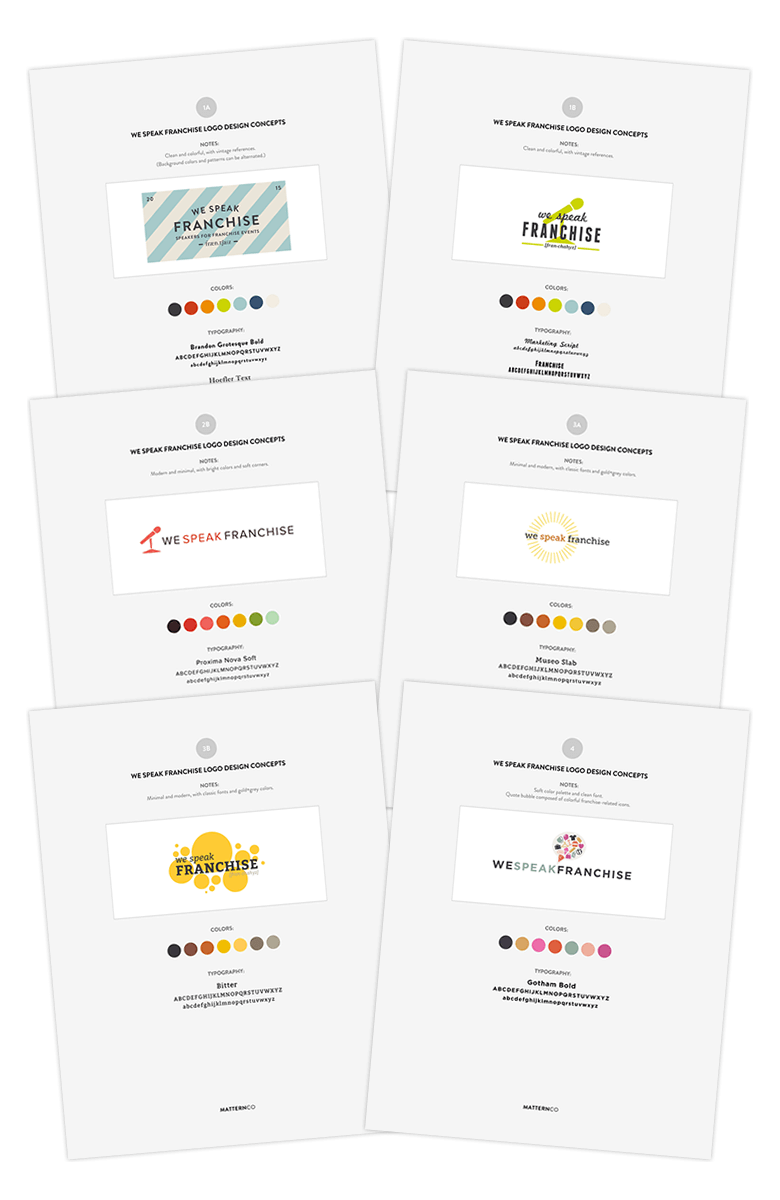
Round 2. The client had two favorite concepts from round 1 and wanted to see different color variations for one and different layouts for the other. Armed with this input, round 2 explored the two preferred directions further.
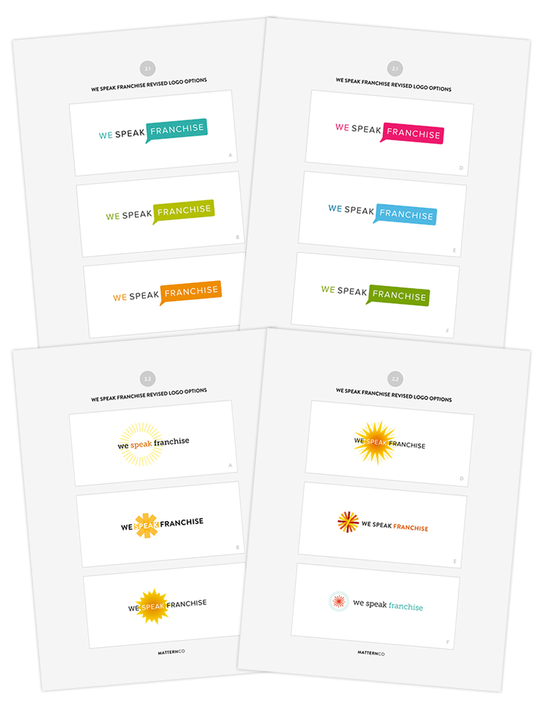
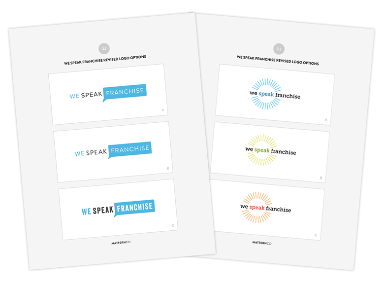
Round 3. The client selected a color for their preferred logo but also wanted to see a few more color variations for another design. This final revision round explored font options for the first logo and a few color options for the second.
Final design. The client selected their preferred logo. It’s bright, clean and modern and will look great on everything from business cards to posters.

Final Logo
IntraNerve Brand Family
The IntraNerve family of companies (IntraNerve, IntraDiagnostics and PRNRead) specializes in medical monitoring for complex brain, spine, vascular and other surgical procedures. Going into our project, IntraNerve knew they wanted a clean and modern logo that used its existing beige/burgundy color palette and could be varied for its three companies. They wanted to explore icons suggesting nerves, graphs and brain activity.
Round 1. Round one presented iterations of three concepts: a ‘satellite brain’, a ‘graph brain’ and a ‘nerve kaleidoscope.’
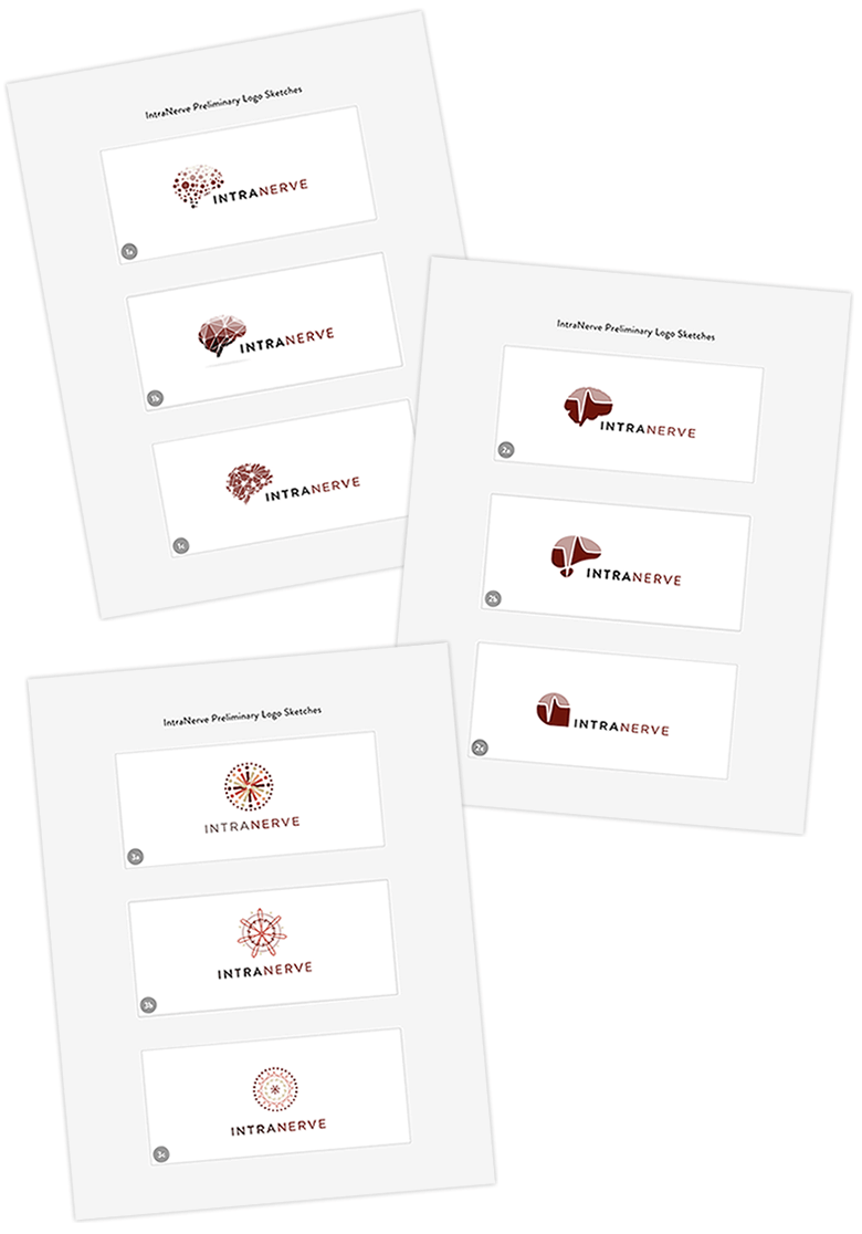
Round 2. The client strongly preferred one of the ‘satellite brain’ designs, so this round fine-tuned the design and presented color variations for the brand family.
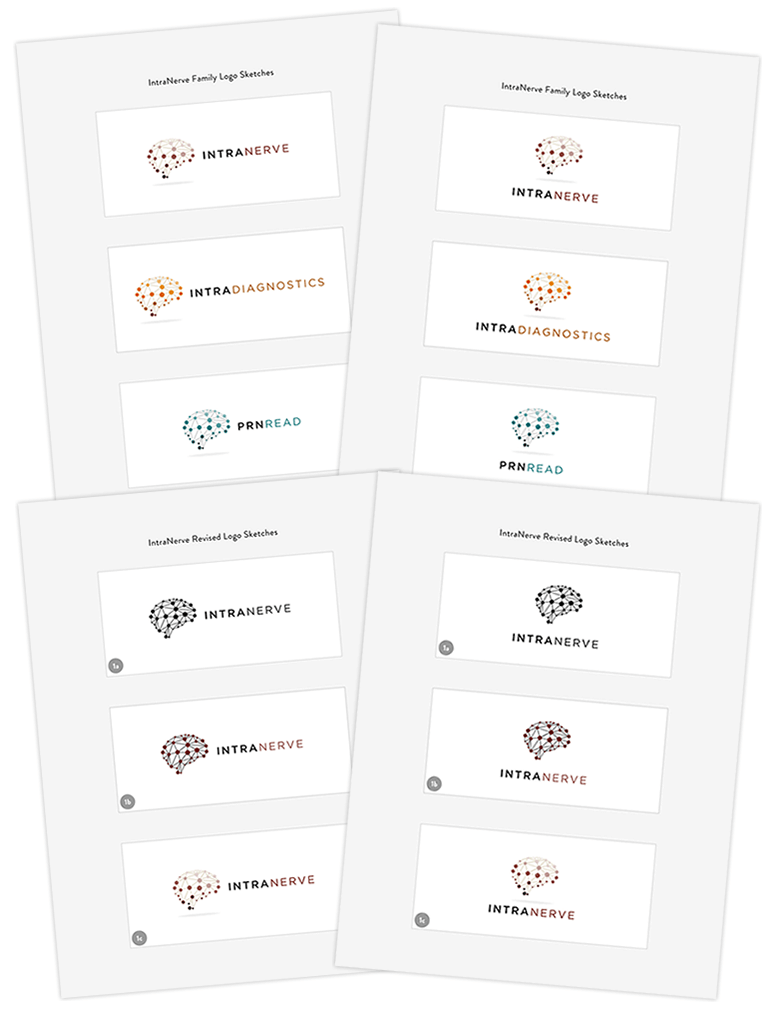
Round 3. The final revision round continued to refine the preferred design, exploring different shading, placement and scale options.
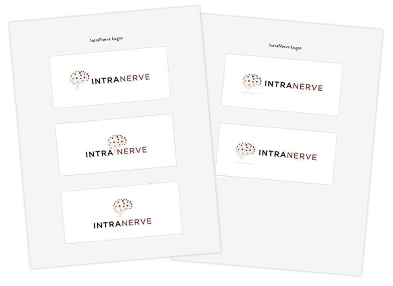
Final design. The client selected a final design, a sleek and modern logo. Branding guidelines were established for the three companies.
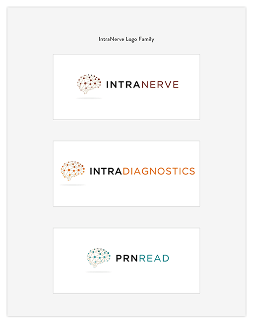
Final Brand Family
CRECE
CRECE is the Center for Research, Equity and Collaborative Engagement at the California State University, East Bay. The center wanted a logo that represented its three core facets (research, equity and engagement). They also requested an icon with open hands to represent their open, inclusive philosophy. Our logo design project was condensed into two short rounds to be as cost and time efficient as possible.
Round 1. The first round presented two logo options, both using the concept of open hands with three leaves to represent the organization’s three facets.
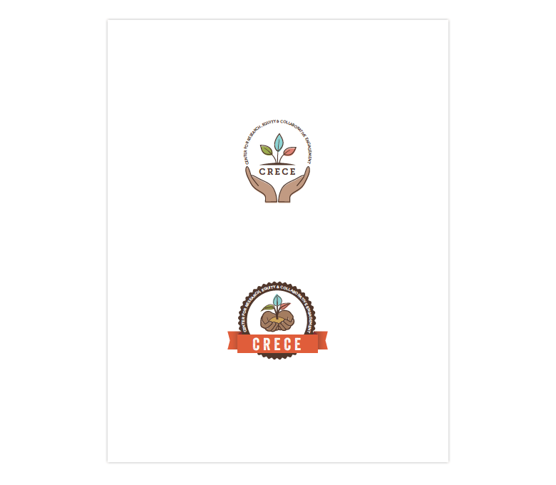
Final design. The center selected one of the designs, a warm and friendly logo, to use in outreach materials.
Final Logo
StashWall
StashWall, an online tool for organizing digital materials and simplifying lives, wanted a bright, modern logo to symbolize its misson and inspire its growth.
Round 1. Round one included a few general sketches to get the client’s input on concepts and colors.
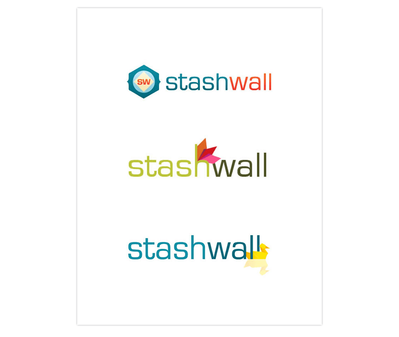
Round 2. Round two explored additional concepts involving boxes and security, as well as color options for a preferred box concept.
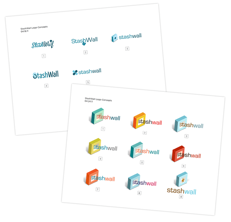
Working logo. The client selected a “box” concept initially as a working logo for early prototypes.
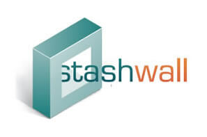
Working Logo
Final design. During design of the application, one additional logo was presented. The team liked this direction best and decided to move forward with it.
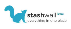
Final Logo
Porcellino
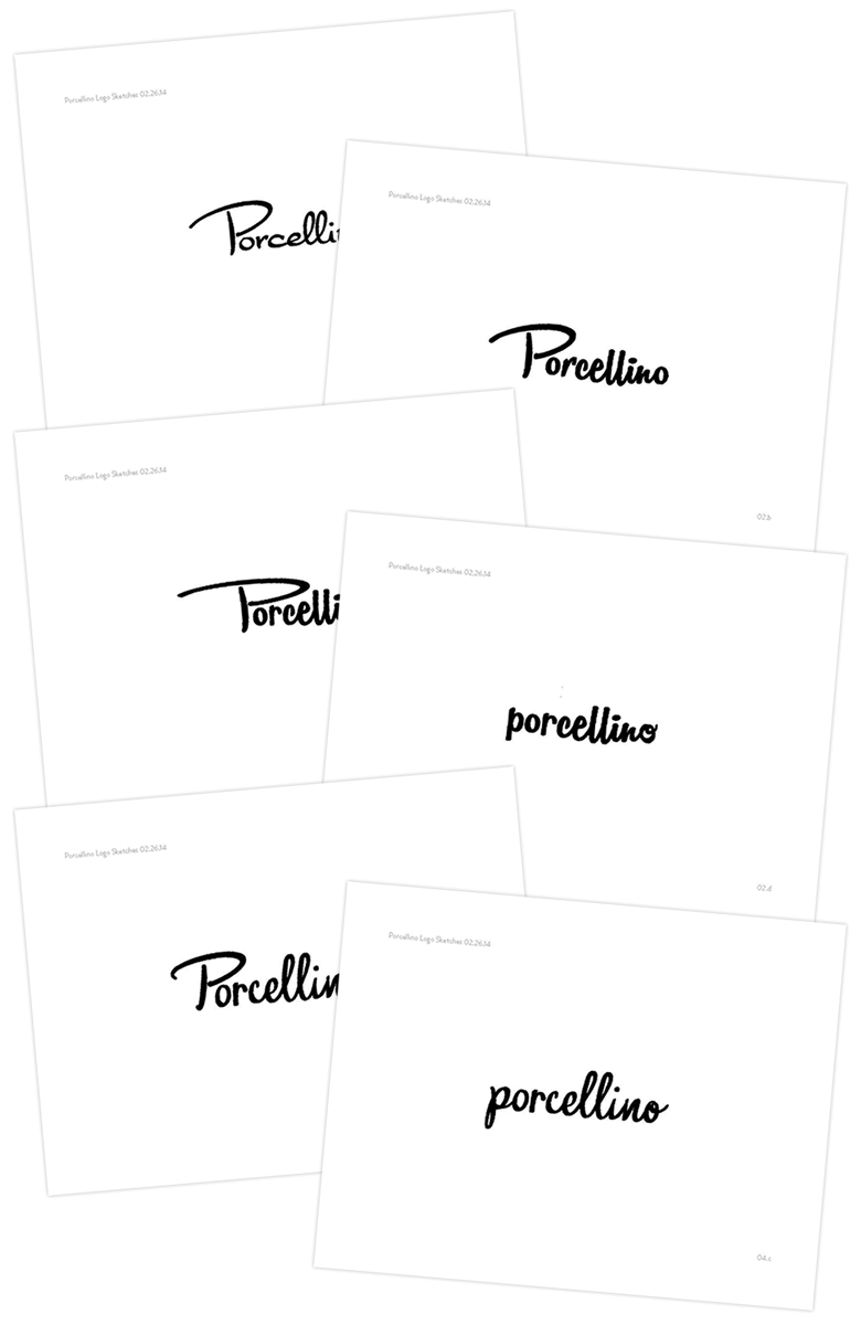
Porcellino (piglet in Italian), a new restaurant in San Francisco, was looking for a simple and casual logo. They preferred a black and white palette with a customized script font.
Round 1. The first round presented a variety of customized script fonts to get input and preferences.
Round 2. The second round explored different ‘piglet’ icon concepts with the preferred script font.
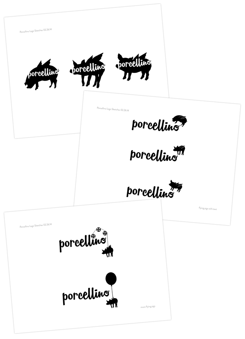
Round 3. In this round we fine-tuned the script font and explored options for incorporating a flying piglet icon.
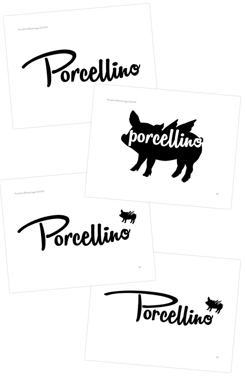
Final design. The client selected a final script logo. They also selected a flying piglet icon to use as a watermark and stamp in marketing materials.
Final Logo
Watermark
8 Responses
This is so interesting, and so much more complicated than I ever thought, on so many levels. The ability to really listen is a rare gift, and along with your exceptional talent it makes you the very best! Thanks again, Sarah, for a marvelous essay.
Thank you! xo
Thanks for sharing this! I love seeing how creative you are with other projects. I think Porcellino’s round 3 and final flying pig icons were my favorites. 🙂 (Great, now I have to go eat there.)
Thanks Rosie! It is fun to see what people like best from the mix!
I love the concept of visual eavesdropping! Great insight into the creative process. Thank you for sharing:-)
Thanks Yoli!
I love all the logos, although CRECE’s particularly stands out for me; it’s quite lovely. I am impressed by the caliber of clients who seek your help! You’ve also introduced me to some companies/organizations I’m now interested in checking out as well. Interesting to see your work process; so talented.
Thanks so much Jeanene for taking a look and sharing your thoughts!