“Always aspire to create aesthetic designs. Aesthetic designs are perceived as easier to use, are more readily accepted and used over time, and promote creative thinking and problem solving. Aesthetic designs also foster positive relationships with people, making them more tolerant of problems with a design.”
– Lidwell, Holden & Butler, Universal Principles of Design
Design is everywhere, and I’m a firm believer that everyone can enjoy designing.
I work with clients in fields as diverse as marketing, sales, writing, accounting, counseling, engineering, law, programming, education, entertainment, food, interior design, healthcare and more.
Not only are these clients often the creative directors and design reviewers for the projects we work on together, but they also often want to design their own materials, such as postcards, business cards, presentations, blog posts, brochures, proposals and videos.
With today’s access to simple software and online tools, more people than ever are able to create their own designs. But no matter if you are an experienced designer or a professional from another field, we all face the same complexity: how to design content that is as easily understood and aesthetic as possible.
The six basic design tips below are some of my favorites that I use often to simplify not only my design process, but also what I’m designing. If you find these tips helpful, I invite you to download the free printable tipsheet to keep on hand for easy reference.
I’d also love to learn about your own favorite design tips in the comments below.

1. Get inspired
Start with a Google image search that relates to your project: “legal business cards,” “best blog post designs,” “quirky presentation slides.” Browse around and get inspired. Download images that you love (click on “view image” to view the full size image, then control+click on a Mac or right click on a PC to save the image). Save your images in a digital “swipe file” so you can come back and look at them again later for inspiration. Note the colors and fonts you like and the layouts and compositions you find appealing. WhatTheFont.com helps you identify fonts from images, and ColorHunter.com lets you create a color palette from an image.

2. Sketch it
Sketching is a great way to unleash your creativity and get unstuck. It also helps you explore layouts before committing to a more time-intensive digital design too early. Before designing with digital tools, take out a pen and paper and start sketching possible compositions. Explore how you might place all of your assets (headlines, text, photos, graphics, buttons, quotes, etc) and identify any additional assets you still need. Keep your “swipe file” from tip #1 handy for inspiration. Once you transition to digital design tools, refer to your sketches for direction. If you ever get stuck in your digital designing, come back to your notebook and sketch some more.

3. Align to a grid
A grid simplifies the process of placing elements by giving you columns (and possibly rows) to line up edges along. As often happens, what’s simpler for you as a designer is also simpler for your audience: alignment to a grid helps lead a viewer through a design and creates a sense of unity and cohesion1. Using a grid doesn’t mean a design needs to be boring. I usually use a 12-column grid when designing websites, which lets me mix and match sections extending 1 to 12 columns in length. But even a simple grid of two, three or four columns will give you both cohesion and some flexibility, simplifying your design process. Learn how to create a column grid in an earlier post.

4. Stay golden
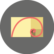
To nicely contradict the even-grid tip in #3, along comes the golden ratio (also known as the golden mean). In mathematics, two numbers are in a golden ratio if the ratio of the two numbers (a is to b) is the same as their sum to the bigger number (a+b is to a). This creates a geometric symmetry that is believed to be aesthetically pleasing and has been used in art, architecture and design throughout history. When I get stuck with a design, I often refer to the golden ratio to give myself a framework for dividing a space into two sections. The math is simpler than you’d think: take the total width or height of the available space and divide it by 1.61803398875 to get the larger section. Then take the total width or height minus the larger section to get the smaller section.

5. Think in threes
Three is a magic number. Tidy and symmetrical, yet still a little odd, three is a designer’s best friend. Not merely good looking, three can also be easily scanned and understood. Grouping your content into three balanced parts will give you a solid structure for your design, and it will help your viewers quickly digest your content. I’m thinking three columns, three images, three headlines, three paragraphs, three buttons… Three can help you (and your design) out a lot.

6. Less is more
Less is often more in design. Whitespace, or the space between elements, should be considered a fundamental component of design, as it improves readability, comprehension and aesthetics. The best way to ensure “less” is to edit text down to the fewest words possible, select graphics for relevance and quality, and moderate fonts and colors. A single readable body font paired with a contrasting header will give your design a simple yet sophisticated look2. Just 3 to 6 balanced colors (plus shades of these colors and black/grey and white) will give you a consistent palette for backgrounds, text and imagery3.
1 Lidwell, William, Kritina Holden, and Jill Butler. Universal Principles of Design. Berverly, MA: Rockport, 2010.
2 Browse font combinations at Fontpair.co and Justmytype.co.
3 You can explore and create color palettes at ColourLovers.com. You can get shades of colors at colorpicker.

8 Responses
Yes! Design is everything! (That is, if you figure mindfulness and intentionalty are by design, too…)
Anyway, I think your # 6 is the toughest. I am editing out wonderful lines in my video because they don’t fit, but I hate to do it. It’s like throwing out your favorite jacket because it doesn’t fit.
Thanks again Sarah, you’re the best!
Thank you! YOU are the best! And I agree that editing down content is always the hardest.
Awesome tips! Thanks Sarah!!
Thanks Lex! Now, to figure out how these apply to designing wreaths…
“Swipe file” — hmm, sounds familiar! 😛 Thanks for sharing, Sarah!
HA! Yes, I’m all about swiping. Thanks Rosie!
Sarah- Love this post! It is so helpful – for me and my clients! And of course, beautifully designed:-)
Thank you Yoli! So glad you found it helpful.