
Hi there,
Well, I’m writing to you this morning about websites that create story worlds.
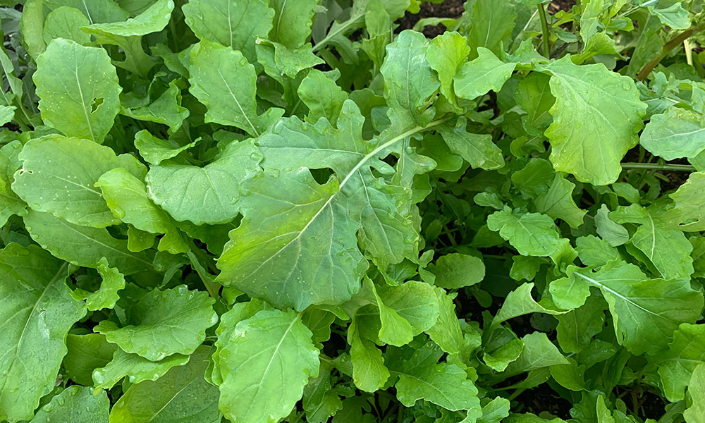
With all of the challenges and uncertainty in the non-story world, I also want to remind us that spring is here. In fact, one of the garden beds has finally decided to burst open with bright peppery green arugula leaves, there are hummingbirds darting across the compost, and bees are buzzing in the rosemary.
These seemingly unrelated things—story worlds and spring—make me hopeful. We humans are capable of caring for so many things that don’t directly line pockets. Our creations, our garden beds, our natural spaces, each other. When we pay attention and nurture thoughtfully, even when the results aren’t immediately apparent, our impact is always renewed energy.
As for websites that create story worlds, what I mean by that are websites that draw you in—to a personality and/or imagination—and make you want to linger. These are websites where people are showing up fully with their unique personalities. They use thoughtful words, visuals, and design details to create inviting, human experiences.
Three example are below. The first is someone I don’t know personally, and it may have been made by the multi-talented individual herself. The last two links are recent collaborations with yours truly.
🐦⬛Maggie Stiefvater: One of my nieces recently told me that this author is a big hit in her middle school circle. Turns out the author isn’t just a young adult novelist, she’s also a graphic novel writer, an adult fiction writer, an artist, and a musician. Her uncomplicated website is also a piece of art. Things that make it distinct:
- Cutouts of Maggie’s artwork are sprinkled throughout.
- It showcases a variety of her creations, including an art gallery and embedded music players.
- A range of bold colors and oversized headers keep things interesting.
🪩 Anat Baron: Anat is a keynote speaker and advisor who strategizes about the future. She and I redesigned her site this winter. Her previous site was clean, simple, and optimized for page speed. This time, we wanted to draw outside the lines and express Anat’s bold and unique vibe. What makes it stand out:
- Brief, stylized text that tells an intriguing story.
- Nostalgic/modern visuals that complement Anat’s compelling on-stage photos.
- Lots of color and a little playful, whimsical motion.
🔎 Eric O’Neill: I worked with cybersecurity expert/speaker/author Eric and the awesome team at Monaco Associates to redesign his website last year. This was one of those projects that came magically together because everyone truly cared about the quality in what they were doing. What pulls a visitor in:
- Great shots of Eric on stage and pondering the cybersecurity threats of the world.
- Thorough yet easily readable content.
- Complementary design details, like background patterns/gradients.
So that’s what I have for you this morning. That and my hopes that you, too, are seeing signs of spring.
xo,
Sarah