Tell a Story is the fourth of five basic ways to simplify your next creative project. Storytelling is a tool I use to simplify my design work, and it’s a practice that can be used to simplify other creative projects as well.
Storytelling might not be something you’d consider relevant in design, especially in the world of fairly straightforward and minimal web design where the goal of a project is to clearly communicate products and services.
Sure, there might be an About page with text about the company and its owner. But what I’m talking about here is using the non-textual visual design elements—the images, colors, fonts, textures, patterns, and other details—to tell a story.
When I get stuck during the design phase of a project, as I often do, especially perhaps with straightforward, minimal sites that are in dire need of some personality, I pause and ask myself, “What story can I tell?” Just asking this question helps me take a few steps back and look at what I’m doing in a new way. From that distance, I can usually see ways to make a design more cohesive, interesting and a little more fun.
“What story can I tell?” is a question that I can’t always answer with words. It’s something that ends up being more like setting the mood for myself while I’m designing, and then I try to convey this mood in a design.
Often, a story can be told visually by evoking nostalgia or by introducing a subtle playful element. But sometimes a story can be much more bold, clearly conveying a persona and a story-world of some kind. Either way, I like the idea that even the simplest of websites can tell a story.
A story is defined as “an account of imaginary or real people and events told for entertainment.” It’s the entertainment part here, the amusement and enjoyment of a viewer, that’s key. Even a simple design, if it has a story to tell, can make a viewer feel good.
As Anthony Wing Kosner wrote on Forbes:
“Why are some companies’ websites more memorable than others? On the surface, it might have to do with originality, visual impact and branding. But what if I were to tell you the most important factor is how a site makes a visitor feel?”
Telling a story and conveying personality in web design can do what all good marketing can do: distinguish a company from its competitors, elicit an emotional response to make a brand memorable, attract customers who are like minded and deter those who aren’t, and create passionate customers who will then form an important marketing channel themselves. Mailchimp and Wufoo, two successful online tools that are designed with story-filled, playful elements, are excellent examples of this.
The question, “What story can I tell?” can be helpful in other creative pursuits as well. Even in creative endeavors where storytelling might not seem evident, like starting a business, painting a landscape, or teaching a class, asking yourself this question can help you think about what you’re doing in a new way. What emotions you want to evoke in your customers, viewers and students? How can you set a mood in your work that will help convey this?
The process of answering this question makes creating more fun. It helps us reframe our creative struggle, divert our busy minds, and step outside of our self-criticisms and doubts. This, more than anything, is why this question is helpful: it helps you enjoy what you’re doing, stay motivated while creating, and create in new and more vibrant ways.
For your amusement, here are a few projects I’ve worked on that I feel demonstrate this practice of storytelling through design:

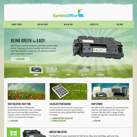
This is the home page for SymbioOffice, a bio toner distributor. The whimsical design set SymbioOffice apart from its peers in the ink cartridge industry.

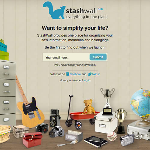
This is the landing page for StashWall, a beta online organization tool that’s designed with a ton of personality. The tool itself, still under wraps, has a handful of themes that each convey a different persona.

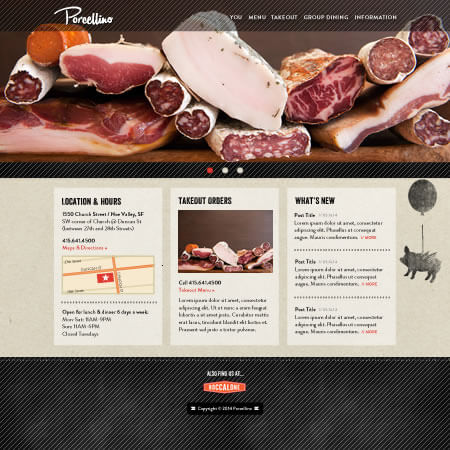
This is the new website for Porcellino, a San Francisco eatery. The website’s design is very minimal and clean, but it still uses nostalgic textures and fonts and a quirky flying pig to add personality.
One more thing before we wrap up: a new story-themed free gift is available today, just for you, with a bow on top.
Wishing you a lovely creative day,
Sarah


3 Responses
Thank you for your excellent article! What a great picture (anyone I know?) I can’t wait to frame it. In an interesting coincidence, we were just asked by a priest friend to help inspire his community through video story-telling, which I also consider to be as much about images as the actual words. Your ideas are going to be a help in getting my own thoughts together for this project.
I always look forward to new releases of your blog—always a new twist, always interesting and informative. Thanks Sarah!
Thank YOU!